Composition
Choosing the Right AI Image Aspect Ratio
Match the canvas to the story, platform, and composition before you generate.
Begin with the destination
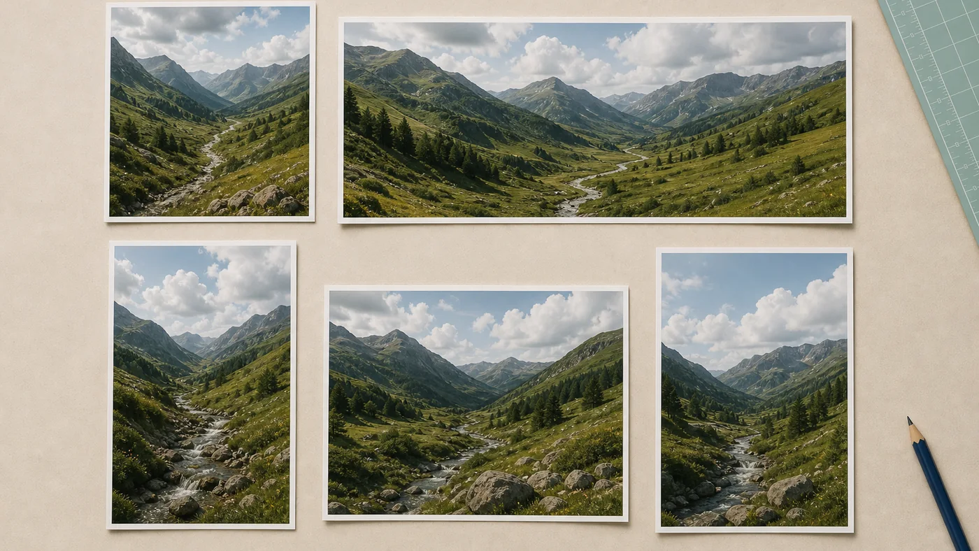
Aspect ratio is not a technical setting to choose at the end. It changes how the model organizes space. A square asks for balance around a center. A wide canvas encourages a path across the frame. A tall canvas favors height, posture, and layered foreground-to-background depth.
Before selecting a ratio, identify where the image will live. A website hero, marketplace thumbnail, printed page, and vertical story create different constraints. Designing for the destination reduces awkward cropping later.
What each ratio encourages
| Ratio | Useful for | Compositional tendency |
|---|---|---|
| 1:1 | Thumbnails, catalog tiles, profile posts | Central balance and compact scenes |
| 16:9 | Website heroes, slides, landscapes | Horizontal movement and environmental context |
| 9:16 | Stories, reels, phone-first posters | Full-body subjects and vertical depth |
| 4:3 | Editorial scenes, presentations | Flexible, natural photographic framing |
| 3:4 | Portraits, products, print-like layouts | Upright emphasis with room around the subject |
A ratio does not guarantee a good composition, but it gives the model a frame to solve.
Square is flexible, not neutral
The 1:1 canvas works well when the subject must survive many placements. It is useful for product images, food, isolated objects, and compact portraits. However, a square can make a landscape feel static if the prompt does not provide depth.
Use diagonals, foreground objects, or off-center placement to avoid a “catalog stamp” feeling. For example: “square composition, cup in the lower-right third, long morning shadow crossing the table.”
Wide frames need a reason to be wide
Choose 16:9 when the environment carries meaning. Landscapes, interiors, teams, vehicles, and narrative scenes benefit from horizontal context. Explain what should fill that extra width. You might ask for a road leading toward a mountain, negative space for headline copy, or a subject positioned to one side.
Wide images used as website heroes also need safe text zones. State where you want visual quiet rather than expecting to overlay text on a busy result.
Vertical images are about more than phones
The 9:16 and 3:4 ratios encourage the eye to move vertically. They suit people, tall products, architecture, fashion, plants, and scenes with distinct foreground, middle ground, and background layers.
For 9:16, describe the full frame: “wet pavement in the foreground, cyclist at mid-distance, narrow buildings rising behind.” Without that structure, the model may enlarge the subject until the frame feels cramped.
Use 3:4 when you want a more traditional portrait or editorial page feeling. It is less extreme than phone-first 9:16 and often easier to crop for print or web cards.
Plan crops before generating
One generated image rarely fits every channel perfectly. If you need several placements, identify a master ratio and protect the subject from edges. A 4:3 or 1:1 master often gives useful crop flexibility. Keep critical faces, text, and product marks away from the trim area.
When multiple outputs matter, generate for each ratio instead of mechanically stretching one image. The model can recompose the scene rather than forcing the same arrangement into a new shape.
Match prompt language to the canvas
Use compositional words that reinforce the chosen ratio:
- Wide: panoramic, lateral movement, leading line, negative space left or right.
- Square: centered balance, radial arrangement, compact still life, symmetrical frame.
- Tall: full-length, vertical layers, upward perspective, foreground-to-background path.
- Classic 4:3: documentary frame, environmental portrait, balanced editorial scene.
For more vocabulary, continue with lighting and composition terms for AI prompts.
A practical decision rule
Choose the destination first, the composition second, and the ratio third. Then write the prompt so the extra space has a purpose. The right aspect ratio is the one that helps the viewer understand the image without relying on a rescue crop.
More from the journal
View all articles →
Prompting
Writing Better Prompts for Grok Imagine
A practical framework for describing subject, setting, light, composition, and mood without burying the idea.
Read article
Technique
Lighting and Composition Terms for AI Prompts
A plain-English field guide to the visual terms that make prompts more precise.
Read article
Workflow
Creating Product Mockups with AI
Plan believable context, materials, camera angles, and review checks for product concepts.
Read article